Pull List – Gideon Falls #1


Story by Jeff Lemire
Pencils by Andrea Sorrentino
Colours by Dave Stewart
Published by Image Comics
Over the past few months my pull list has been a fiasco. Either due to supplier issues, or other little hiccups I’ve ended up with massive gaps and a load of missing #1s. As a result, my comic reading has basically hit a standstill. Sure, I could just fire up Comixology and buy the digital versions, but I’m a bit of a stickler for reading physical issues once I’ve decided to commit to a book. Luckily, the good folks at MyComicShop were able to help a brother out. In a few days I’ll have a fairly hefty order coming my way that’ll plug up every gap, major or minor, that’s popped up in my pull list over the last two years. Provided that Emma doesn’t get in the way, of course.
So, where does that leave us for this week’s Pull List? Well, it leaves us with Gideon Falls. And why does it leave us with Gideon Falls? It’s because I wasn’t quite committed enough to put it on my own pull list, but was still curious enough to want to at least check it out.
Jeff Lemire is one of my favourite writers in the industry at the minute. Royal City was one of my favourite pickups last year, and Descender with Dustin Nyugen is a contender for my favourite comic of all time. That said, the blurb for Gideon Falls didn’t quite pull me in. I have a fair bit of supernatural mystery coming in already, and getting me to add more would require a pretty hard sell. Gideon Falls just didn’t make the cut.
No, Not That Gideon
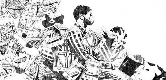
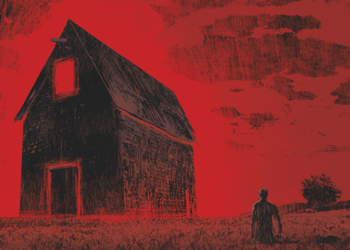
Gideon Falls is a story of two halves. One focuses on Father Fred, the new pastor in our titular rural town. The other follows Norton, a man who searches for miscellaneous objects in a city’s rubbish. Both tales tie together around an old legend about The Black Barn.
Lemire has an amazing ability to flit between each of the characters without breaking flow. It’s never unclear who we’re following at any moment, even if they’re off-panel after a swap. In addition to this, despite being two very different tracks, the two feel very much like one continuous story. The pacing is slow and decompressed to begin with, gradually building towards the revelations of the final pages.
As much as I enjoyed going through it all, I was left feeling as if the end came too soon. Slow pacing and decompression are great, especially when used this well. In general I’m a bigger fan of them than most. However, I was left feeling as if I’d just read half a book, or watched an episode only to be left with an ending that should’ve been an ad-break.
Empty Zone
As great as Lemire‘s story crafting is, Sorrentino‘s penciling is what really stole the show for me. Every panel is sort of beautifully empty. There’s one, central detail that you absolutely need to pay attention to, and the rest is purposefully blank. It’s by far the most excellent use of negative space I’ve seen in a book. It goes along with Lemire‘s storytelling in wide, cinema-style panels to create a perfect, slow pace.
These panels aren’t even the main draw, no, that honour lies with the astounding splash pages. If the page-to-page panels are empty, the splash pages couldn’t be more opposite. They fill every corner with detail and overlapping images to really jar your mind. It’s a very brilliant, very meta style to go with, and it really pays off. Seeing it here, I’m amazed I haven’t seen the like of it in other supernatural books.
Unfortunately, Stewart‘s colours didn’t hit the same high note that the underlying pencils did. He uses a combination of dull, ruddy purples and washed out blue/green greys for the respective tracks. The former sets a fitting tone for a warm night in a quiet rural town at twilight. The latter for a bland, monotonous cityscape. I can see the effect he was going for, and it works well to hold the tone of the book as a whole, but unfortunately, it causes individual panels to fall flat. I will sympathize that leaving the panels feeling empty is a tough job though, and he makes a very admirable attempt. The exceptions here are, once again, those amazing splash pages.
The Mystery Shack
Overall, I have to say I enjoyed reading this opening issue of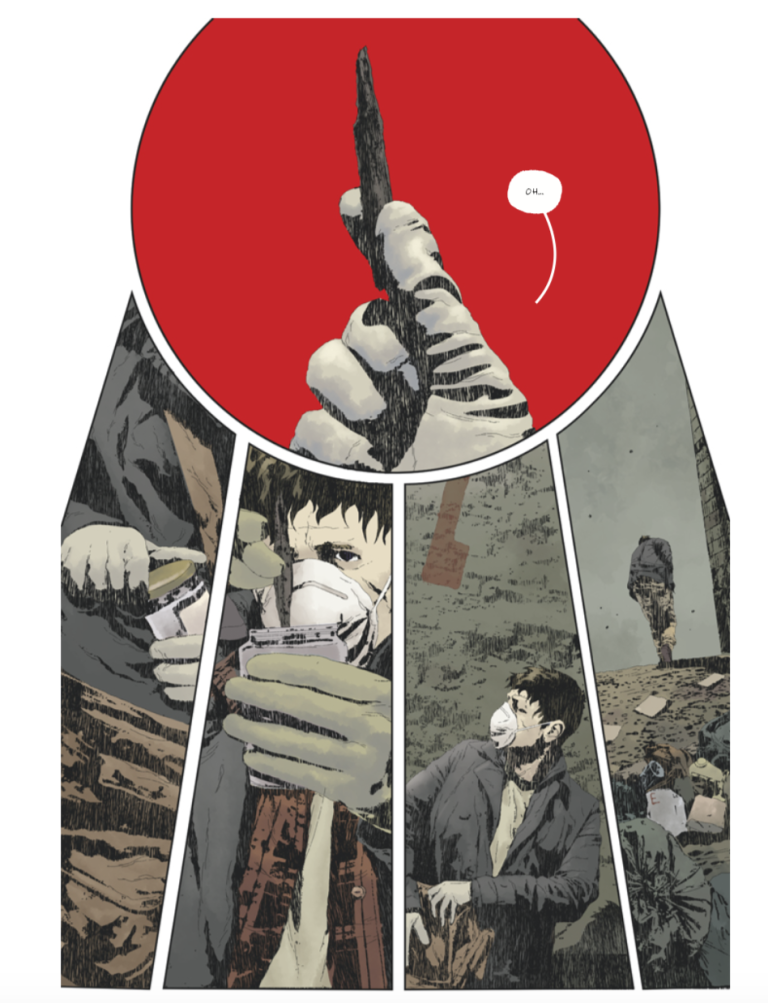 Gideon Falls. At the same time, I do not regret leaving it on the proverbial shelf initially. The story is solid, for what there is of it. The art, taking the book as a whole, can really draw you in. Despite these two points of praise, I didn’t feel like I got a proper bang for my buck.
If the creator-owned comic sector was in healthier shape, this might have been released as a 20 page free preview of the overall book. The book could perhaps have double shipped so it wasn’t left feeling quite so, to use the word in a negative light for once, empty. To me, it screams “Buy me as a collection, not as individual issues”, and that’s probably what I’ll do. For now, I’ll be giving it a miss.
P.S. Trade Waiting kills series’ and I’d never usually recommend it. Support your favourite creators folks! ….Until the antiquated numbers-system catches up with the modern world.