


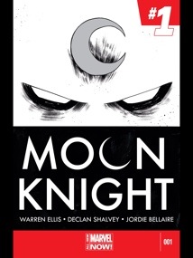
 Writer: Warren Ellis. Artist: Declan Shalvey. Color Art: Jordie Bellaire. Letterer: Chris Eliopoulos. Published by Marvel Comics.
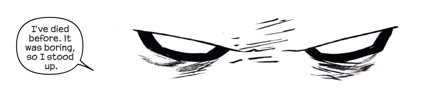
Moon Knight has always been one of those characters that given the right creative team can be incredible. The problem is though with so many different visions, incarnations and iterations of the character over the years that it can be more than challenging to find a new direction for Moon Knight that either hasn’t been done or just won’t fly in the face of everything that came before. With the latest relaunch the new creative team on Moon Knight #1 manages to do just that though. Warren Ellis and Declan Shalvey manage to account for previous views on Marvel’s local lunatic vigilante as well as carving a new way forward. And yes, while Moon Knight #1 changes things up again, it does so to clean house on the many layers of complex and varied mischaracterization over the years to distill the character down to his core elements, focusing on Moon Knight’s vigilante activities and, well whether or not he is bonkers or not.
 So this issue kicks off with a Marc Spector, fresh from his latest mental breakdown from Brian Bendis’s fan favourite run a few years back, now calling himself “Mr. Knight,” doing the whole ‘pulp mystery man’ thing complete with his slick new suit and weaponized limousine and working with the NYPD to solve some gritty and gruesome murders and having learnt a little more about just what is going on with his mental condition.
Rather than kick off an ongoing case for Moon Knight this issue serves to bring us up to speed with what’s new with Moon Knight and what we can expect in the new direction. What’s more impressive is how Ellis manages to respect the many previous aliases while tying them together in in the latest revelation on Moon Knights mental status, which implies ‘Mr. Knight‘ is not the only incarnation of the character we’ll see moving forward in this series. Meaning we can appreciate a glimpse at this aspect of him a little more. So while some might complain this issue doesn’t delve into establishing an ongoing plot, addresses just what IS going on in Moon Knights head seems the right way to go for me at least.
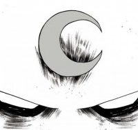
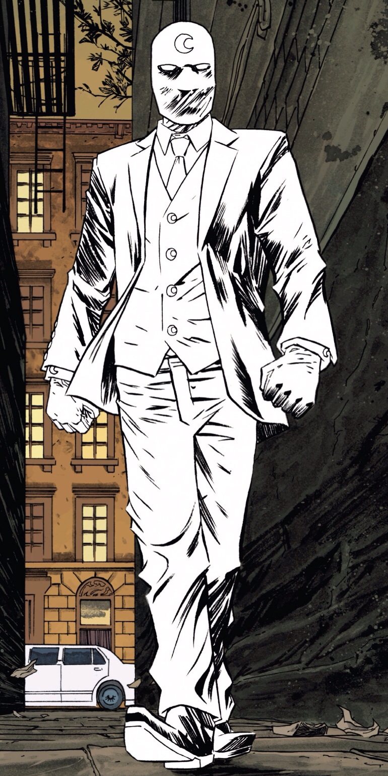
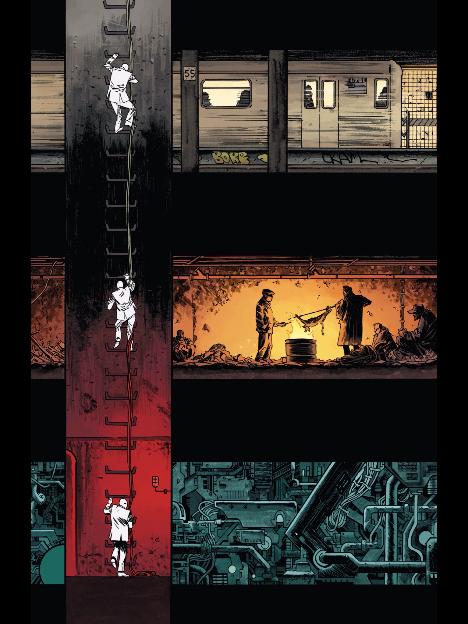 Now, what really stands out with this issue (and it’ll be apparent to anyone who’s read it) is the art. Moon Knight’s always had some of the best artists in the biz over the years. From David Finch through to Alex Maleev each artist has taken their own approach and brought something new. Declan Shalvey’s take on the book is no exception. Shalvey and colorist Jordie Bellaire do as much to reimagine the character as Ellis himself. Shalvey’s newly designed Moon Knight is crisp-white and bitchin. Shalvey knows how to show us exactly what’s going on with only what we need to see and only when, carefully leading the eye across the page from panel to panel his use of expression and general body-language give us Moon Knights mood and confidence conveying all we need without ever seeing the face under the mask. Bellaire’s colors are literally outstanding. Outstanding in the sense that they embellish and paint the scenery and characters surrounding Moon Knights blank slate. The character himself remains untouched by any color save his crisp ‘so they’ll see me coming’ white. Another thing I’ve noticed but almost couldn’t figure out right away was the lettering. While Marvel generally capitalise their fonts Moon Knight #1 does not, and believe it or not it does really set it aside from other books.
I can safely say without a doubt Ellis, Shalvey and Bellaire’s names will be synonymous with Moon Knight for years to come with their work on this run.