Back Issues: Captivating Covers


Browsing the shelves at your local comic haunt can be incredibly soothing, and although you may not be able to stop yourself from picking up an issue or two, sometimes it’s enough just to admire the sometimes stunning covers that don our favourite titles.
This week for ‘Back Issues’, I’ll be discussing the power of an intriguing cover and the elevated expectations it creates for the issue as a whole.
Bucky Barnes: The Winter Solider #9
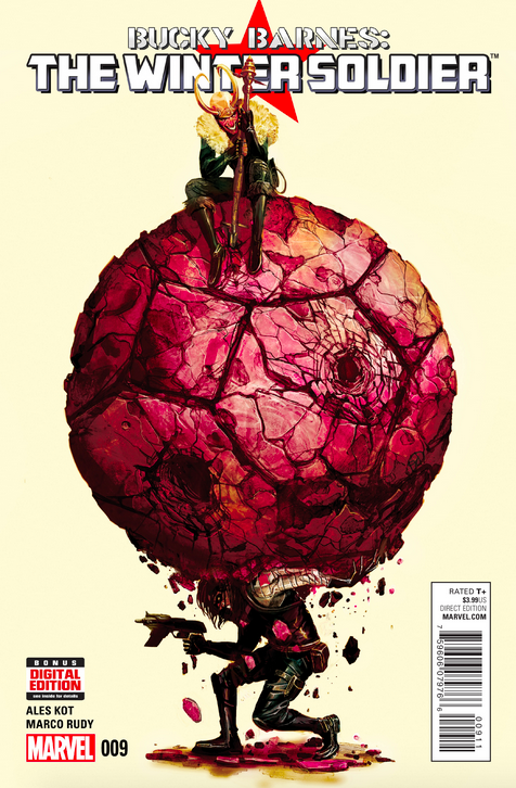 Although many covers for the Bucky Barnes: The Winter Soldier series have been unusually beautiful, this one in particular really stood out to me. Drawn by Michael Del Mundo, this is the type of cover that stops me in my tracks in the aisle and, even though I hadn’t read the previous eight issues, it was one of those comics that you just had to have, regardless of the quality of the story or inside art.
Fortunately for me, the style inside is truly stunning; drawn by Marco Rudy, it’s by far the most gorgeous art I’ve ever seen in a comic book I’ve picked up. It’s so raw and fluid, with splashes of bright water colour in unexpected places, and then thick black lines and dark, inky shapes once you turn the page. In fact, the gorgeous cover that totally drew me in doesn’t even remotely do the inside justice. That being said, the cover itself features a struggling Bucky Barnes as he takes the weight of the world on his shoulders with a delighted Loki sitting pretty on top.
The art perfectly captures Loki’s mischievous nature, as he sits looking down at his handy work while clinging to his staff while Bucky cowers below. This cover certainly did its job of seducing the money right out of my purse and I was happy when I realised the quality of my purchase.
The Umbrella Academy #4
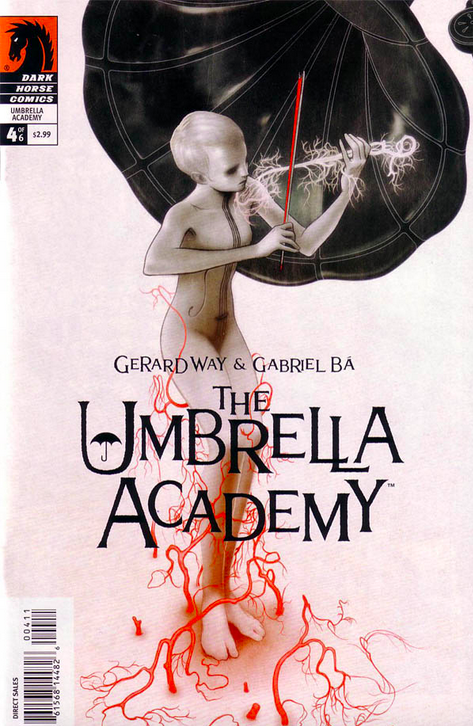
Created by Gerard Way and Gabriel Bá, I first heard of The Umbrella Academy when I was deep into the My Chemical Romance phase that towered over my awkward teenage years. Before they were released I knew that no matter how bad the story or the art, I was going to buy each and every one as, after all, that’s what a good little obsessed fan does.
I was pleasantly surprised to fall straight in love with the cover art, which I thought was unusual, arresting and beautiful. I really liked the quirky story too, so I waited impatiently for every copy of the six-issue special. Although I loved each of the covers in their own way, none caught my attention as much as the fourth issue, featuring the character of Vanya, the white violin.
Strikingly beautiful with shades of black, white, grey and nuclear red, Vanya looks like an ethereal statue with what looks like nerve endings climbing up her pale legs. Drawn by James Jean, probably my favourite aspect of the cover is that she’s playing what looks like nerves, or fine hairs, in the shape of a violin. Gorgeous.
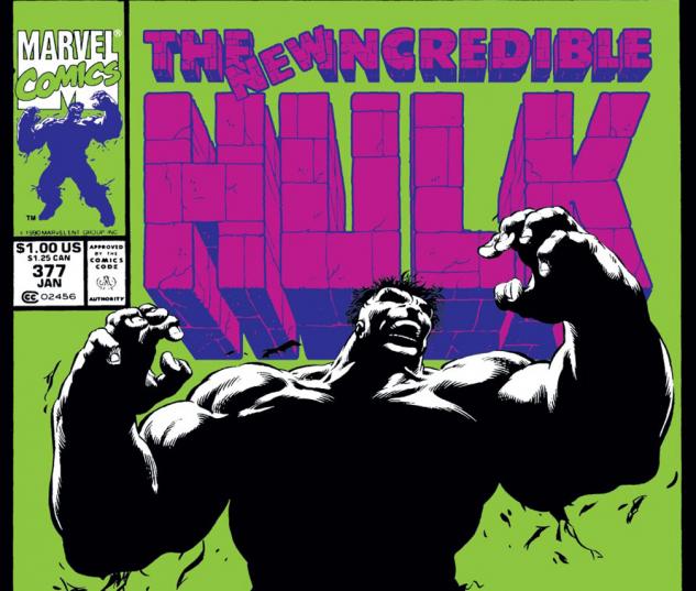
The New Incredible Hulk #377
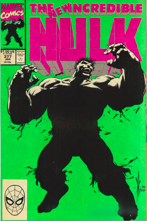
The bold green and bubble-pop purple colours on this cover are fantastic. Marking the return of the green hulk with a bang, the cover truly does sell itself despite the fact that the Hulk can be seen in silhouette.
It would’ve been easy to have a white background or similar and plant a big, mean and green Hulk centre-stage but this works better somehow.
Drawn by Dale Keown and Tom McLeod, both of whom have long histories of awesome covers, this is definitely one of my all-time favourites, particularly as I don’t usually find any of the Hulk covers that interesting. This one really stands out for me.
Fables #127
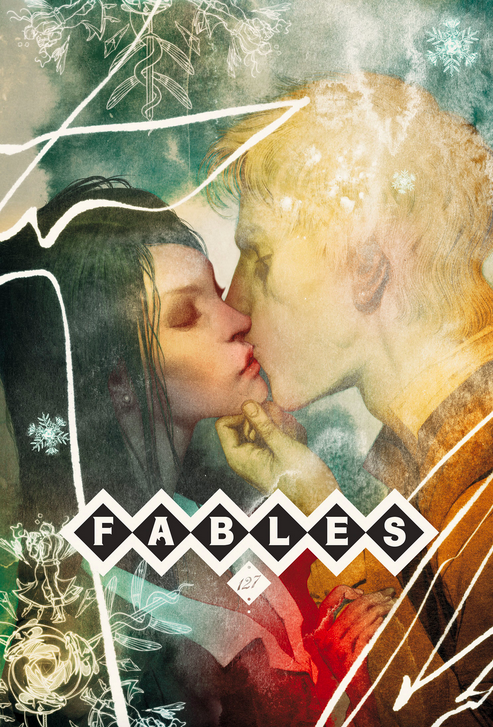 The Fables series has had some truly amazing covers, both demonstrating the artisan themes behind the story and the talent in the industry today. They’re the type of covers that you’d love to buy without the text and serial numbers of a comic so that you can display them the way they were meant to be seen; as framed art.
The Fables covers have set the standard for iconic and beautiful covers and over its long and successful run, it consistently came out as the cream of the crop.
Although the comic itself wasn’t that thrilling, nobody could deny that the cover art, drawn by Joao Ruas, is well above par. With a thirteen year run, one would expect the comic has been able to harness the talents of the best of the best through its reputation, and it certainly hasn’t disappointed.
The characters on the cover look both ethereal and romantic, and a little scary. They are so realistic looking while still seeming like they’re behind a veil, concealed from the world, which is a good way to go about it for a story that is, in essence, based on myth and legend and… fairy tales. It’s this kind of tone in the cover art that I appreciate, which you don’t get the chance to experience with the inside art, as it’s a lot less detailed.
Astro City #4
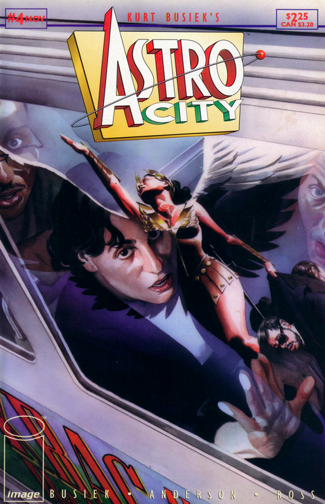 The number 4 seems to be fairly popular in this list, and this cover from the Astro City series deserves pride of place. The cover is fantastic as it focuses on a civilian’s reaction to the super powered being above him. This is something the Astro City series is great for in that it shows the perspective of the normal humans surrounding these godly people flying above them.
That’s something that I don’t see that often in other comic series or indeed on other covers. I particularly liked this one as it seems to be painted with some gorgeous muted metallic colours that make the picture seem so real.
The series has some really stunning variant covers as well, but I have to say these poignant snippets of life portrayed on the cover give me great expectations as to what is to come inside.