


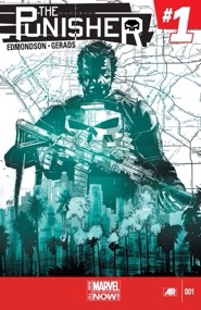
 Writer: Nathan Edmondson. Artist: Mitch Gerads. Lettering: VC’s Cory Petit. Young Variant Covers: Larroca & Martin; Samnee & Wilson. Cover: Mitch Gerads. Publisher: Marvel Comics.
How do you raise the L.A murder rate while lowering the crime rate?
You move The Punisher out west.
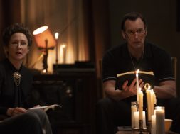
Frank Castle has set up shop in Los Angeles, Great news for the reader, terrible news for L.A’s gangs. This new issue #1 see’s Frank recovered from Greg Rucka’s fantastic run and now working (and presumably hiding out) out west. Right off the bat this is a great issue and a strong start for what I’m predicting to be a very successful series. While it is still the Punisher we know, Edmonson’s already showing us another side to Castle. Franks now clean shaven and even manages to crack a smile over breakfast while he makes small talk with an NYPD officer (and not a very astute one if she didn’t recognize Frank Castle) in the local diner. But wait, don’t worry. California hasn’t mellowed ‘ole Frank out though. He still kills absolutely anything that he feels warrants his usual brand of punishment. No seriously, He kills them. He kills them dead.
“We need The Punisher around here. More than we need the Avengers, because everyone isn’t afraid of the Avengers.”
Like other Punisher series before, Edmonson’s Punisher has a dark streak of humor to it. The “Don’t touch my gun.” scene early on … I actually lol’d. But before I could even stop to think “Should be laughing at this?” His … interrogation we’ll just call it, in the traffic jam was hilarious and harrowing all at the same time. Also, don’t ever make fun of his car. You will pay. Also worthy of a mention is a throw away scene of Frank driving out to a meet in the desert in his new camper. It just REEKS of Breaking Bad. It can’t have been an accident. I loved it. It was class.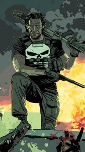
Now as any comic book fan will tell you, the artist can make or break a series. Comics are after all a visual medium. Mitch Gerads belong on this book. Dam it he’s good. No. Scratch that. He’s great. His style fits the Punisher down to a tee. His line work is very reminiscent of Goran Parlov’s or even Laurence Campbell’s work on the Punisher from previous titles before. Subtle things make up all the differences here, his panel layouts and character placement within are impeccable. He truly knows how to lead the eye across the page in an effortless fashion. But what really sets him over the top in my opinion is his color work. Between the murky green and grey of the swamps to the golden veil of California sunlight tainted across the day, not forgetting all the muzzle flare, blood splatters and explosions in this issue too and god knows there’s a lot.
The issue is titled “Memonto Mori,” as is the ring Castle … acquires, and it serves a brilliant little metaphor for the inevitability of death. But as Frank’ll tell you himself, he doesn’t need the reminder. If the end of this issue is anything to go by Mr. Castle is going to have his hands full. As I said its a strong start in a bold new direction for the character while still staying very true to his roots. This is definitely a series you’ll want to get in on now to save yourself the embarrassment of scrounging though the back issue bins 4 or 5 months down the line because your not reading the new hit series everyone else is talking about. Trust me I’ve been there before.
Do yourself the favor and just start reading Punisher now.
[easyreview title=”The Arcade Verdict” cat1title=”Story” cat1detail=”Getting the series off to a great start by reaffirming the Punisher in a new setting with the promise of much more to come. A slow opening sequence is quickly overcome.” cat1rating=”8″ cat2title=”Art” cat2detail=”Gerads’ use of color is genuine pleasure. Smooth panel transitions and slick line work fit the Punisher’s signiture style.” cat2rating=”9″ overall=”true”]